Fast Forward Group
A unified, production‑ready brand system for a fast‑paced, enterprise coaching company—built to drive clarity, adoption, and measurable outcomes across workbooks, campaigns, social, and web.
Fast Forward Group serves enterprise teams with practical coaching and workshops that help people think bigger and execute faster. The brand system supports rapid iteration while staying consistent across every channel.
Fast Forward Group serves enterprise teams with practical coaching and workshops that help people think bigger and execute faster. The brand system supports rapid iteration while staying consistent across every channel.

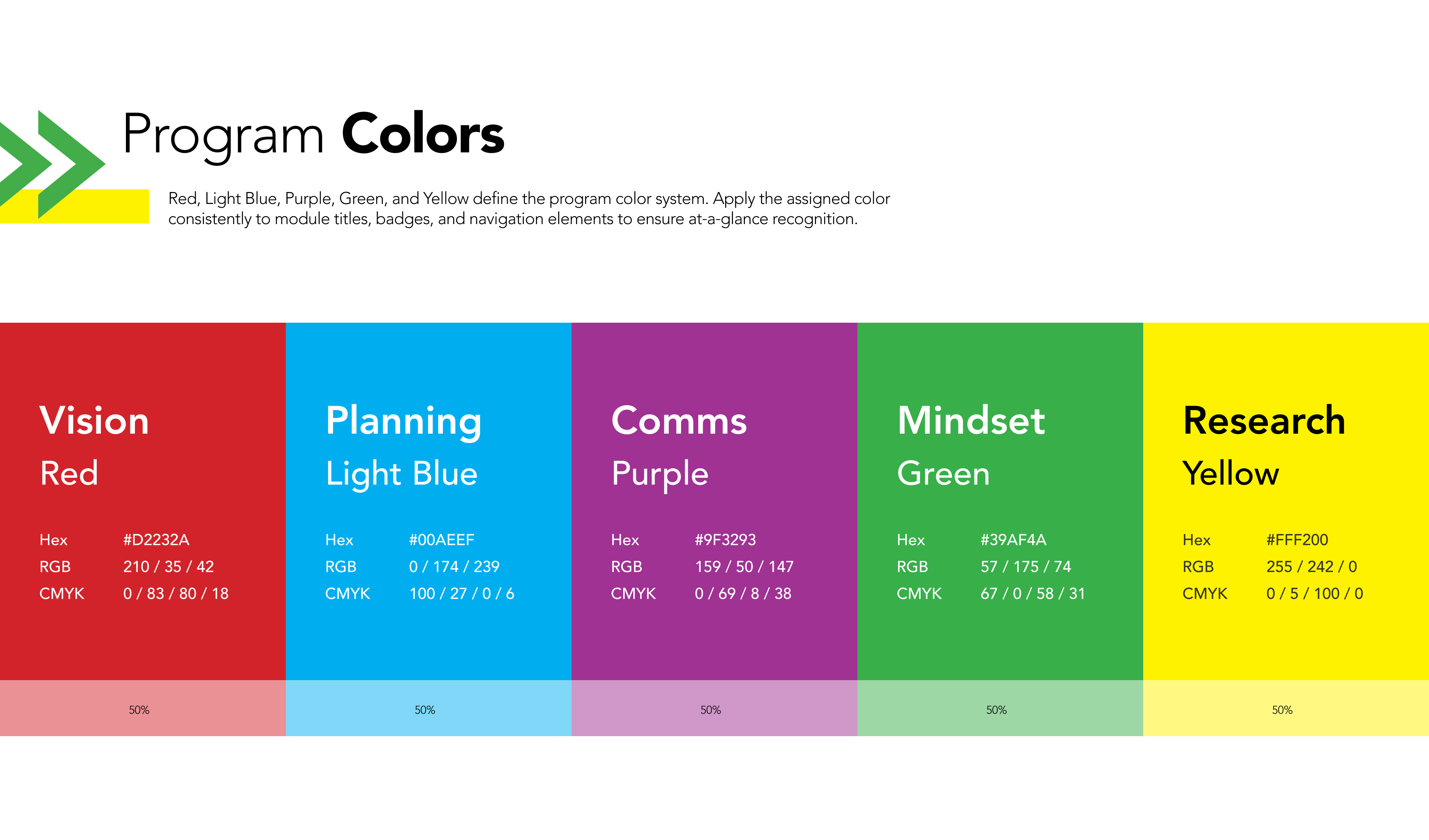
Colors
These examples show how I systematized Fast Forward Group’s palette in practice. Primary Blue and Green drive headlines, callouts, and key UI accents, with Yellow as the accent that adds energy. Cream provides the default background for a bright, readable surface. The program colors (Red, Light Blue, Purple, Green, Yellow) are reserved for module identification—titles, badges, and navigation—so each track is immediately recognizable at a glance. I demonstrated consistent contrast, restrained tints, and disciplined usage across print and digital deliverables.

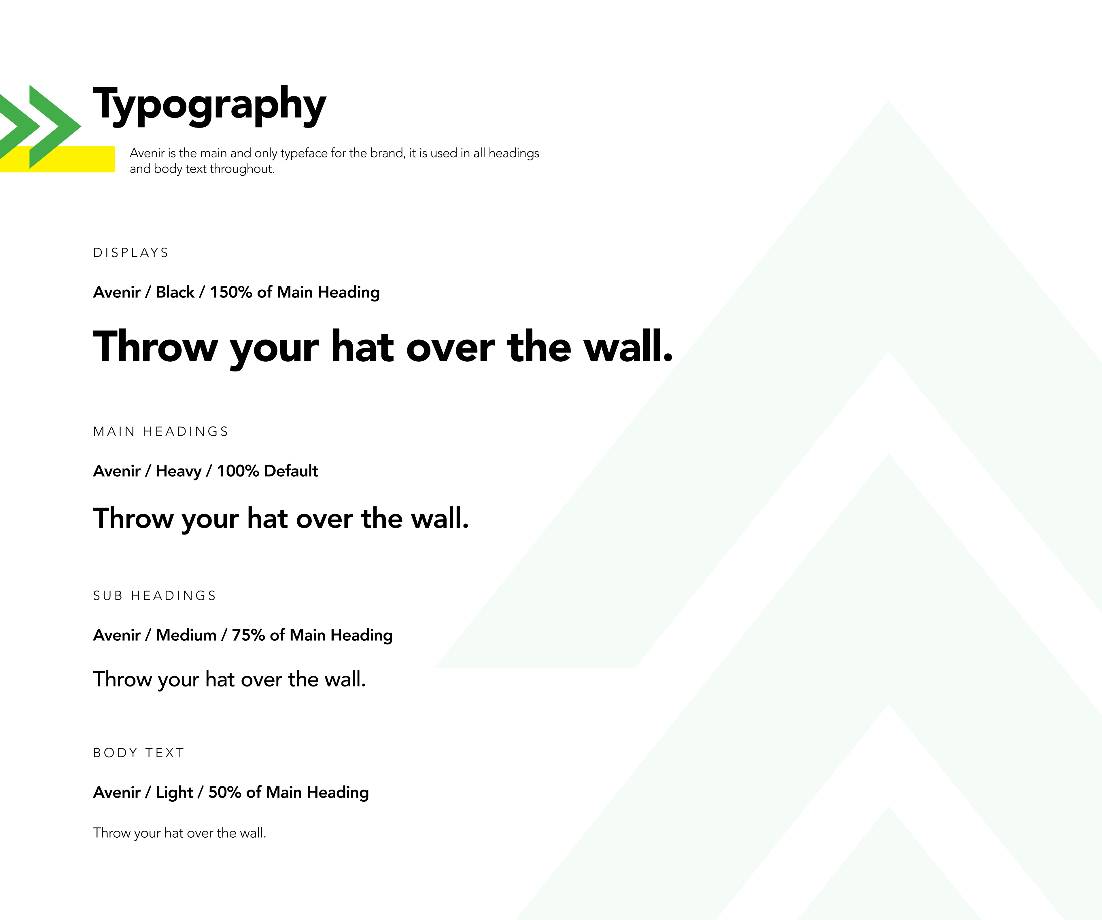
Typography
The examples below demonstrate my typographic hierarchy in context. Avenir serves as the sole type family, with a clear scale from Display through H4 and Body. Emphasis comes from size, weight, spacing, and layout, as shown in the headings and body styles throughout the work. Copy and typography flex to the medium while maintaining a consistent rhythm and accessible reading experience.
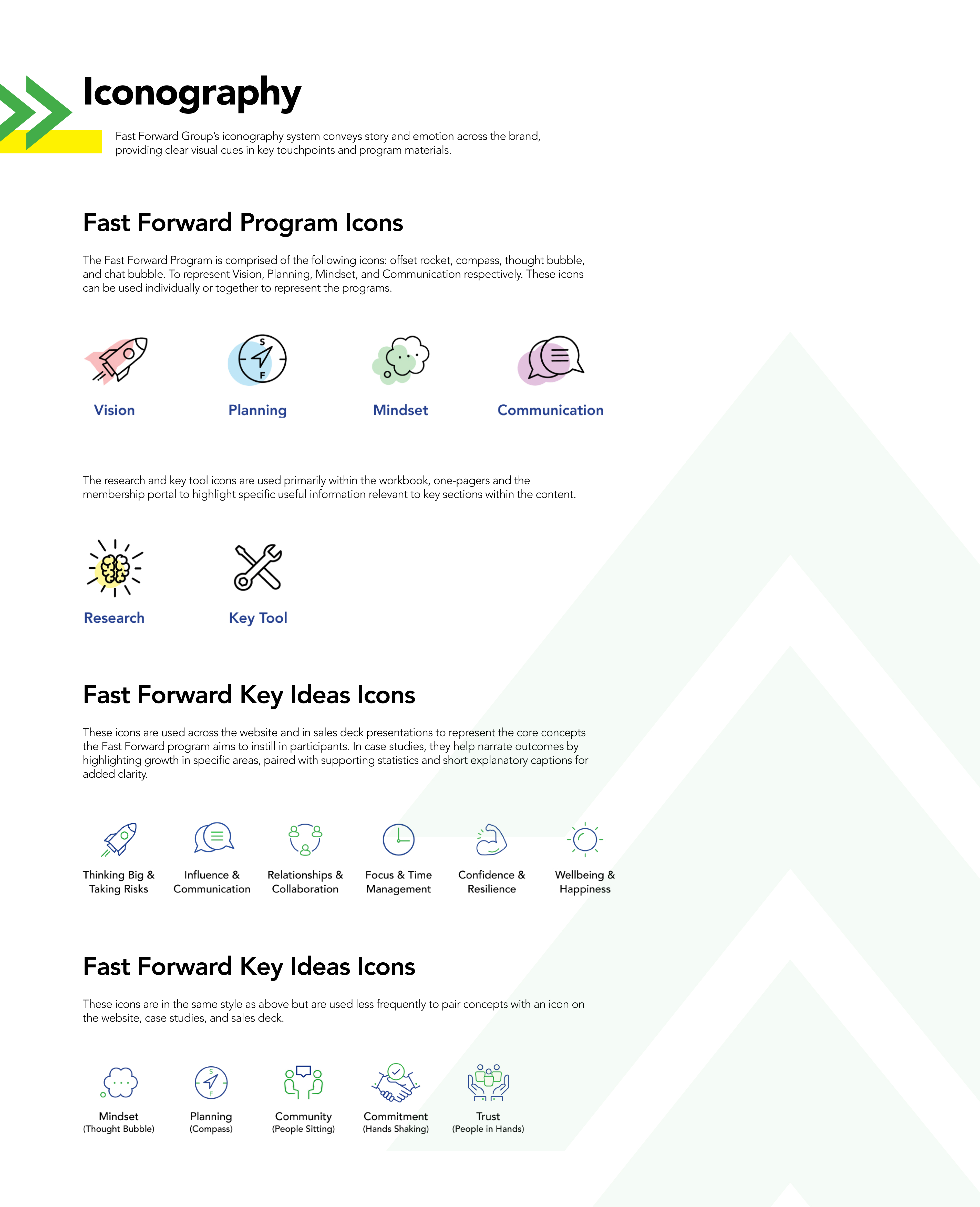
Iconography
These examples show the core icon set to reinforce program concepts: Vision (rocket), Planning (compass), Mindset (thought bubble), and Communication (chat). Each icon follows a shared grid, stroke, and corner language so they read as a family. In long‑form materials and case studies, the icons function as navigational anchors and data callouts, pairing with short captions to guide the reader through outcomes and key insights.
Logo Usage
Here I demonstrate consistent, production‑ready logo application. Clear space equals one cap height of the wordmark on all sides. The examples include primary, reverse, and single‑color treatments, always placed on controlled backgrounds for contrast. I also show common violations to make review and handoff straightforward.

Components
This section illustrates the button system and the supporting arrow asset in use. Primary and Secondary buttons cover most needs. Labels are concise, upper case, and sized for accessibility. The arrow asset appears at low opacity, in Green on Cream, in Cream on Blue and is oriented up or right to signal momentum. In campaign examples, I pair the arrow with high‑priority CTAs to create a clear path to action without adding visual noise.

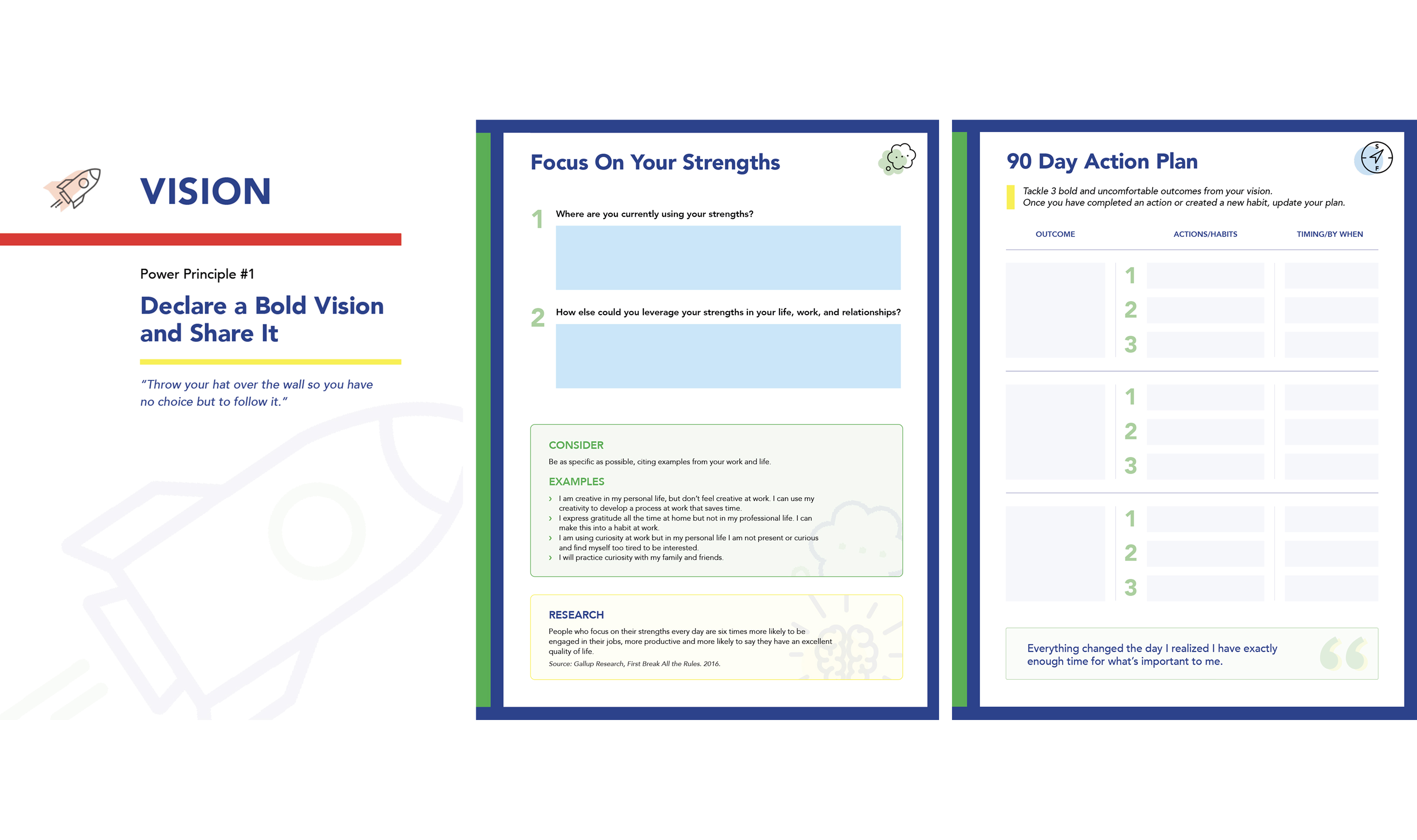
Workbooks
Workbooks and ebooks are the core materials supporting Fast Forward Group’s programs. I’m showing a selected, non‑confidential spread. Typical workbooks run 70+ pages and are continually tailored to client needs, with layouts, exercises, and diagrams updated to support each cohort.

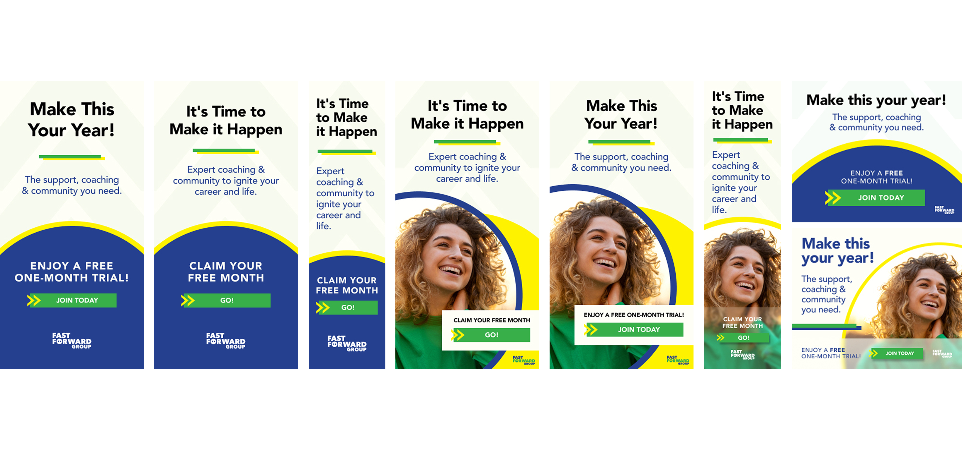
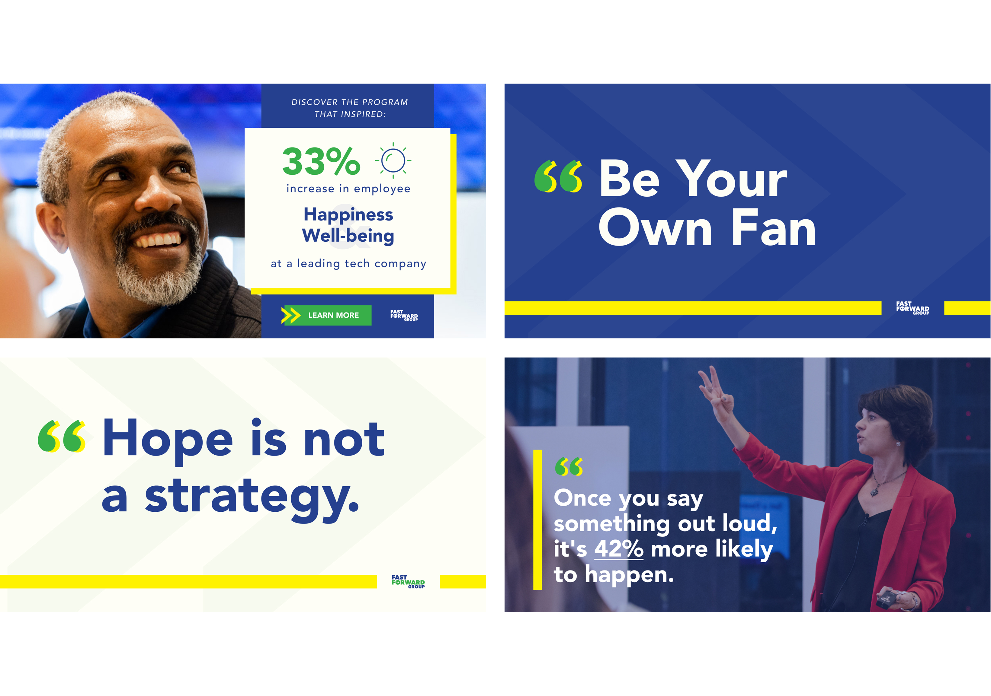
Paid Media Ad Campaigns
Two campaign examples are shown: one for the flagship Fast Forward Group program and one for the new membership portal. I developed message hierarchy, visual system, and channel‑specific variants across static, motion (HTML5), and paid placements. Creative scales from high‑impact headlines to short performance units while maintaining clarity, contrast, and strong calls to action.

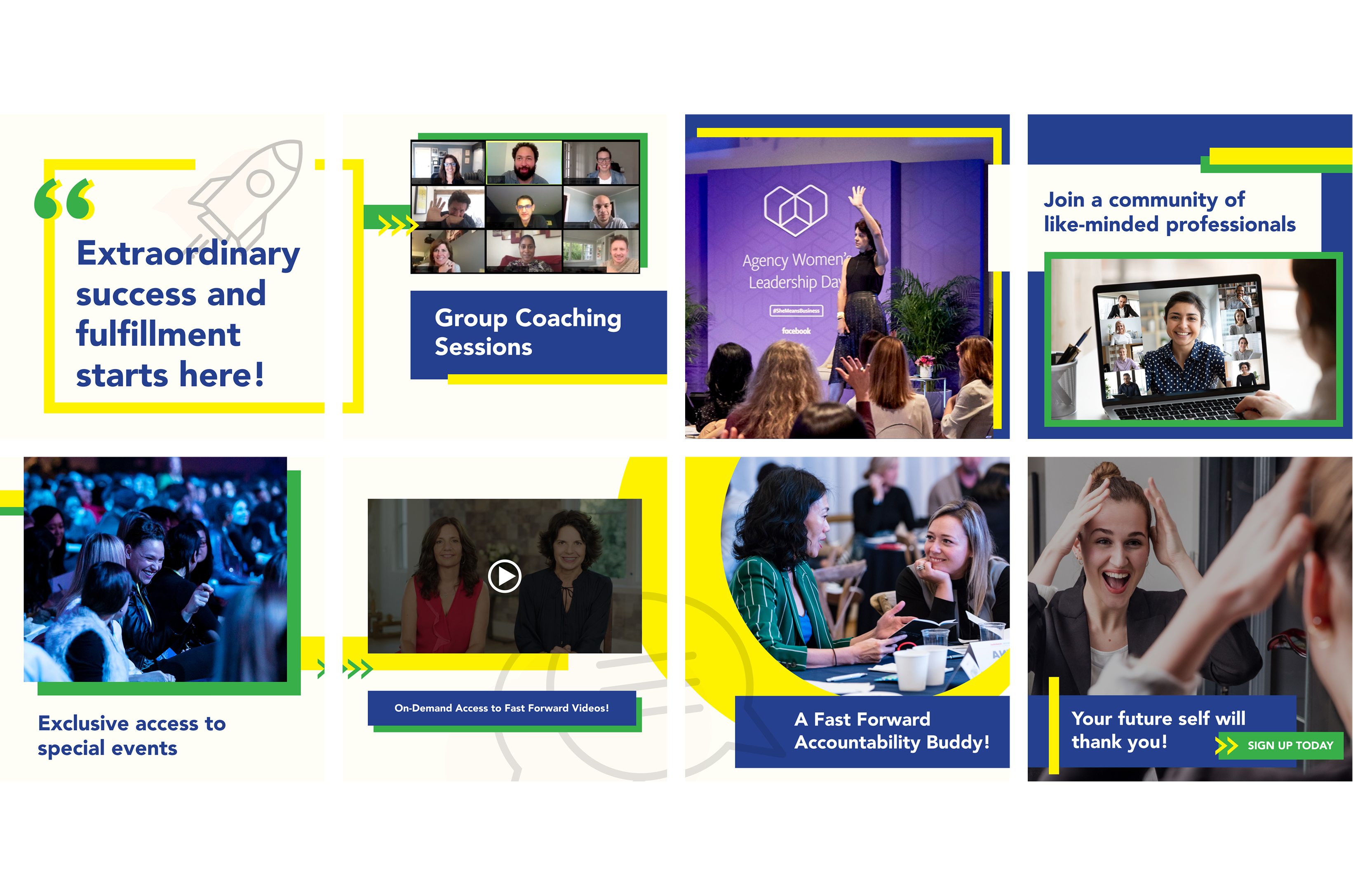
Social Media
Organic and paid social posts for the core business and the membership portal. I built post templates and copy frameworks for quick iteration while preserving brand consistency across formats, from single images to carousels and short video.
Website
A modernized site for Fast Forward Group, designed for clarity, conversion, and ease of maintenance. I led the IA, wireframes, and visual system, then collaborated with an external development partner for implementation and QA. The examples show the homepage and key interior pages with componentized sections, accessible color and type, and clear paths to program signup and membership.
