Personal Ventures
I ran strategy, naming, visual identity, typography and color systems, packaging, e‑commerce, and content for my ventures, Anomaly & Harbor Leaf Tea Co. I owned art direction, photography, documentation, and production handoff to ensure each brand could operate smoothly day to day.
Anomaly
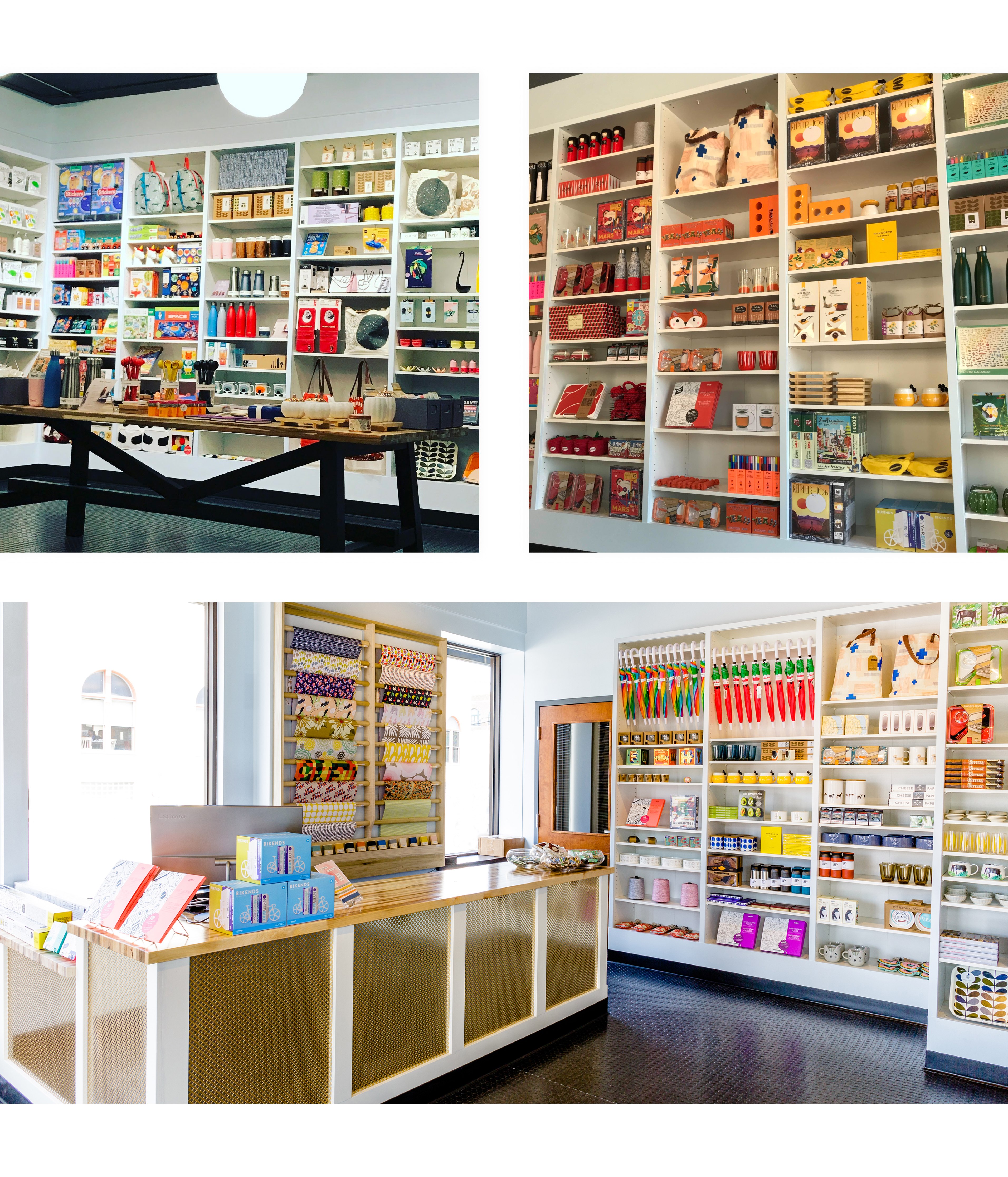
Anomaly was a neighborhood gift boutique that I built from the ground up. I named the brand, designed the identity, and created the full retail experience end-to-end. I led product curation and vendor relationships, developed the merchandising system, photographed inventory, designed and built the website. The aim was a refined, playful space where modern objects felt special and easy to shop.
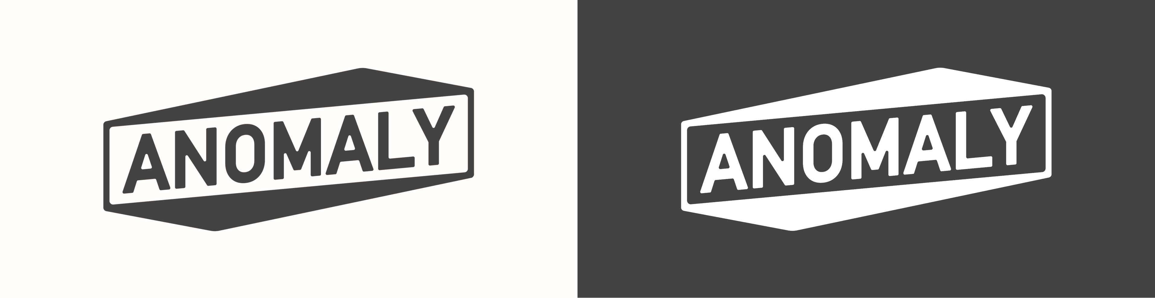
Logo
Light and dark logo variations reinforce the idea of an “anomaly” as something distinct yet balanced. The custom letterforms lean and counter‑lean to suggest tension and equilibrium, so the mark feels slightly off‑axis while remaining intentionally composed.
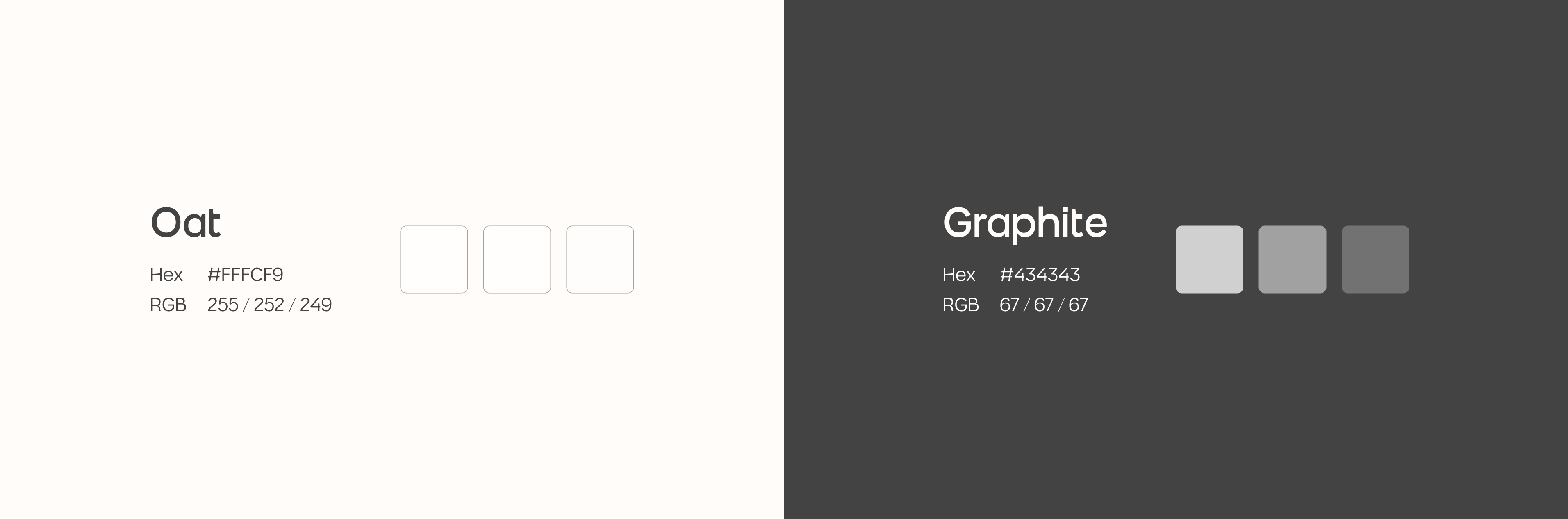
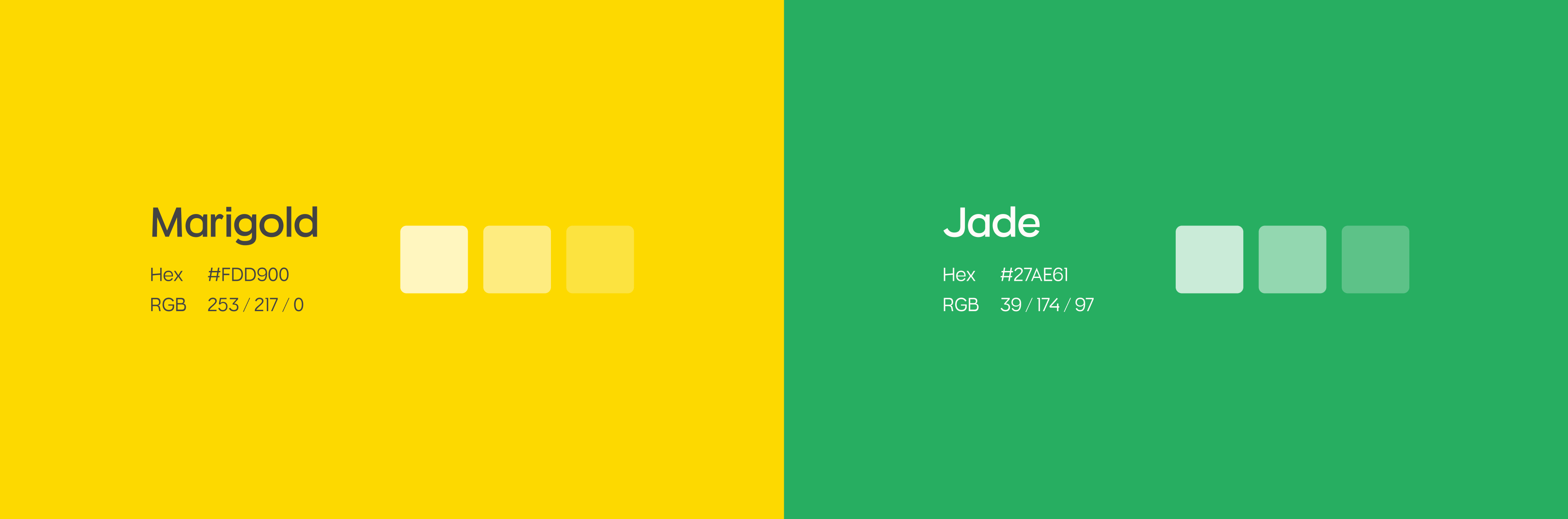
Primary Colors
Oat and Graphite are intentionally understated so the merchandise takes center stage. In store and online, these neutrals create a calm frame that lets product color carry the visual energy. The palette supports legibility, contrast, and long‑term flexibility across packaging, signage, and the site.
Secondary Colors
Secondary accents supported the digital experience across the site and social. They provided emphasis for wayfinding, promotional moments, and UI states when product color was minimal, keeping interactions clear without competing with the merchandise.
Typography
Muring 02 serves as the primary typeface. It’s a little quirky and a little futuristic, which mirrors the brand’s playful refinement. Select characters echo the logo’s angles, and the slanted crossbars reinforce that intentional off‑axis feel without sacrificing readability.

Website
Just like the in‑store experience, the site is designed to let the products shine. I built a simple, high‑contrast layout that foregrounds my own product photography, so color and material read clearly. Navigation stays minimal, pages are fast, and checkout is straightforward.

Physical Merchandising
I developed a modular merchandising system that scaled from window displays to tabletop fixtures. Neutral plinths, consistent sightlines, and tight labeling made it easy to browse, while zone‑based layouts grouped items by use and mood. Seasonal edits refreshed quickly without rebuilding the entire floor.
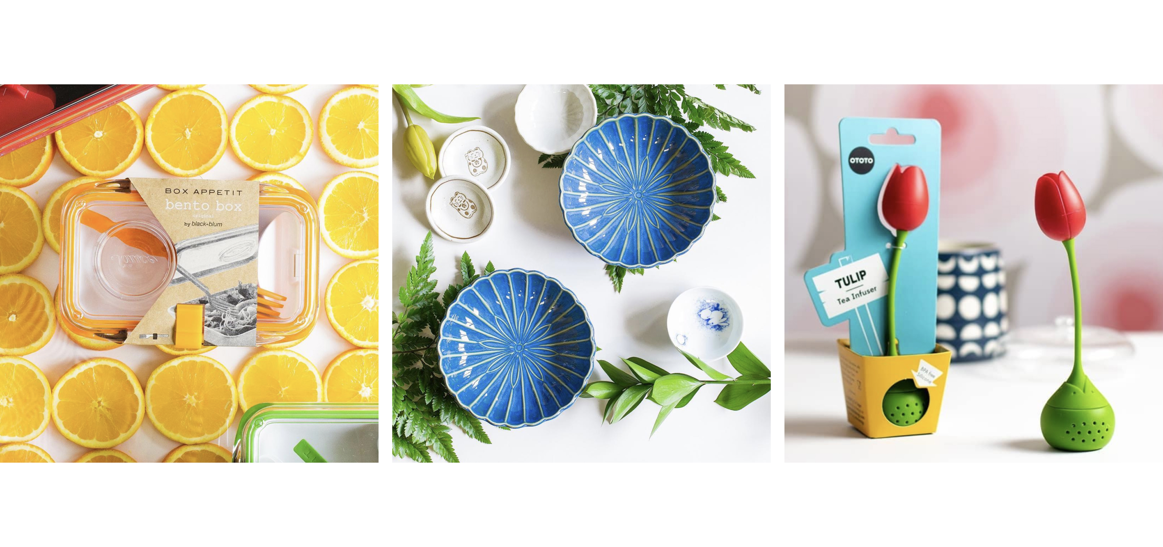
Photography Direction
I shot all product and lifestyle imagery in a controlled style. Clean backdrops, crisp shadows, and close detail emphasized material and finish. The direction carried across ecommerce and social, creating a recognizable look.
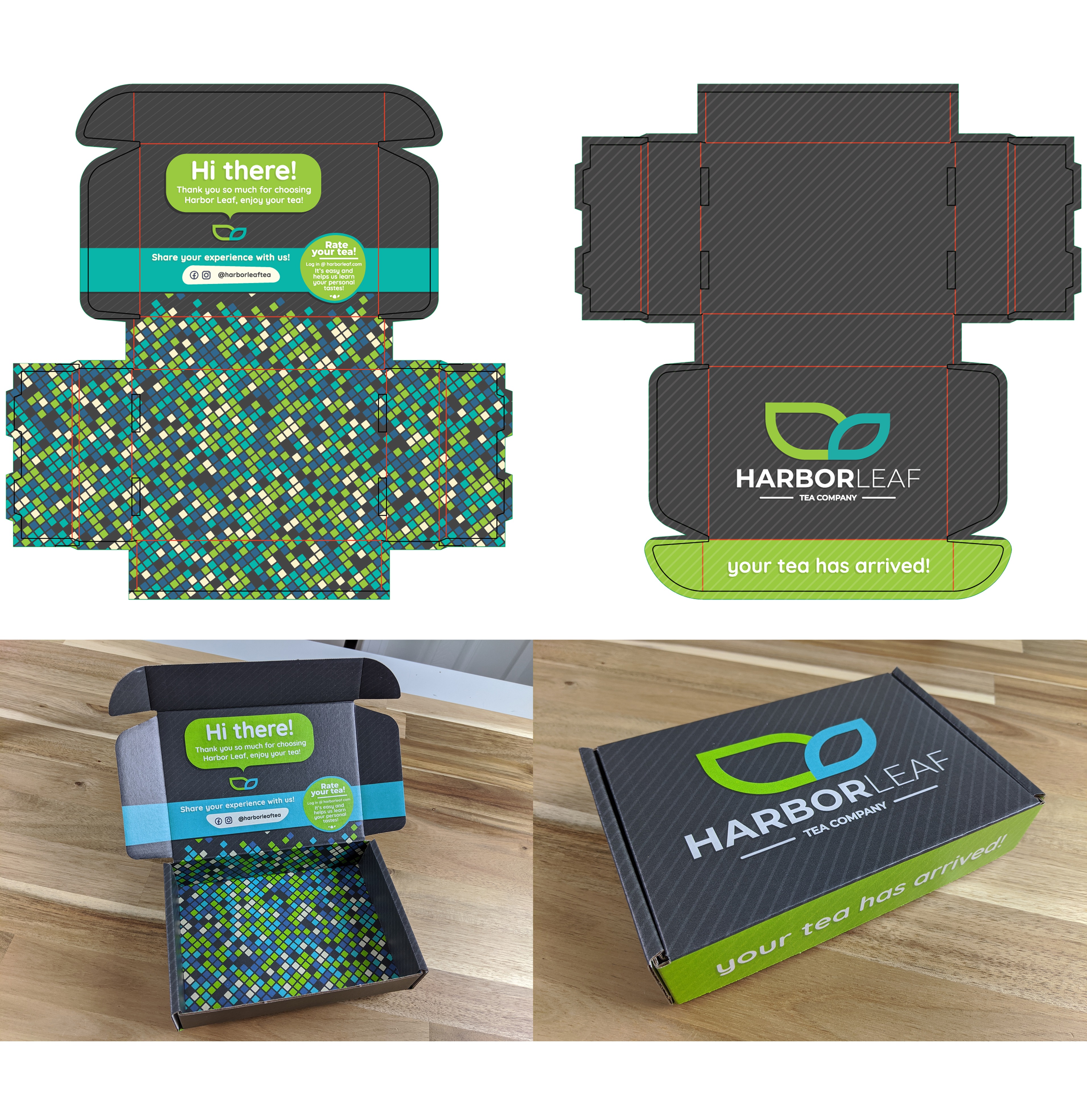
Harbor Leaf Tea Co.
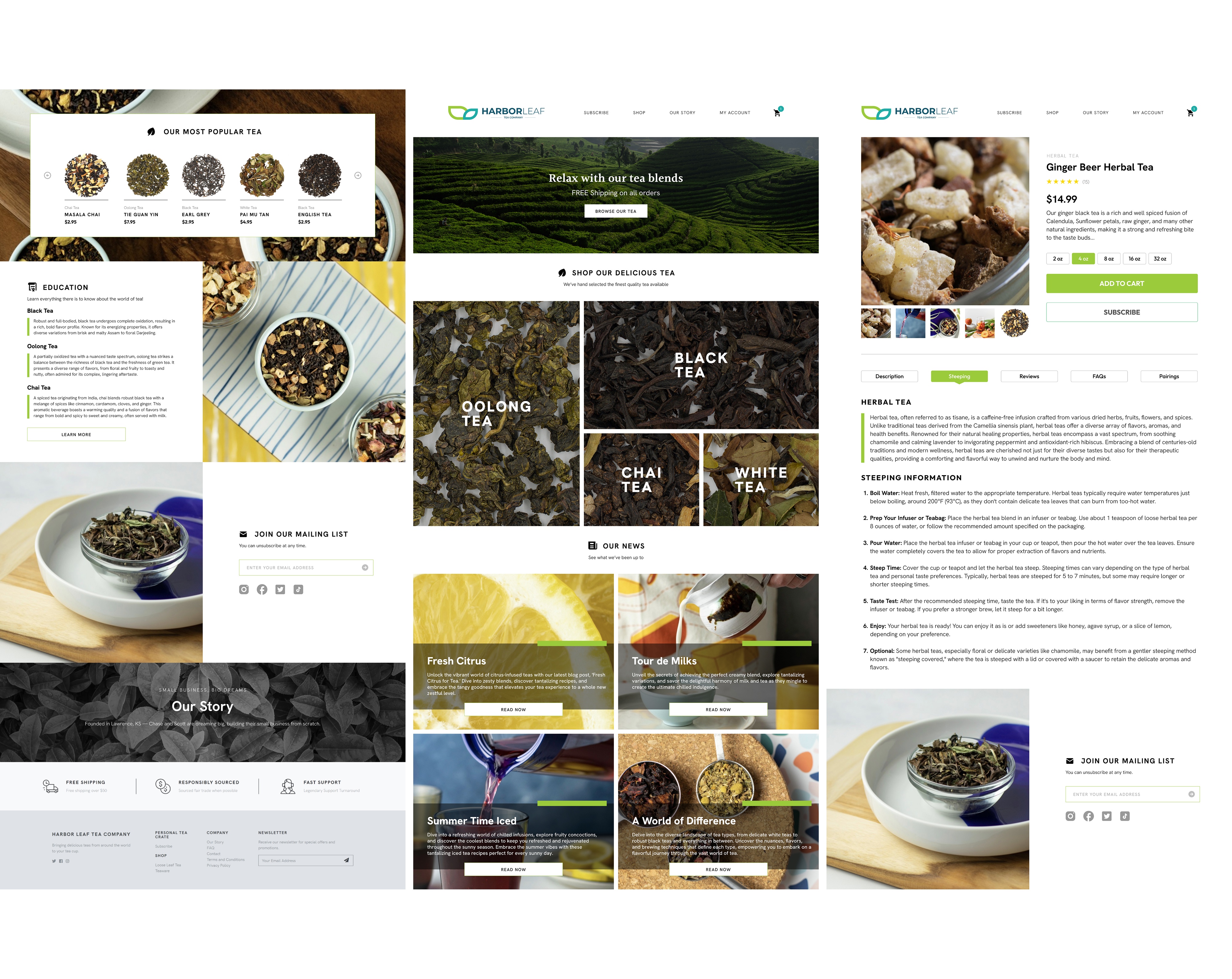
Harbor Leaf Tea Co. is a loose‑leaf tea brand I created end-to-end. I named the brand, designed the identity, built the website, developed packaging for subscription boxes and retail, and defined the photography and content system. The goal was a modern, relaxing experience rooted in ocean imagery and slow‑brew ritual.

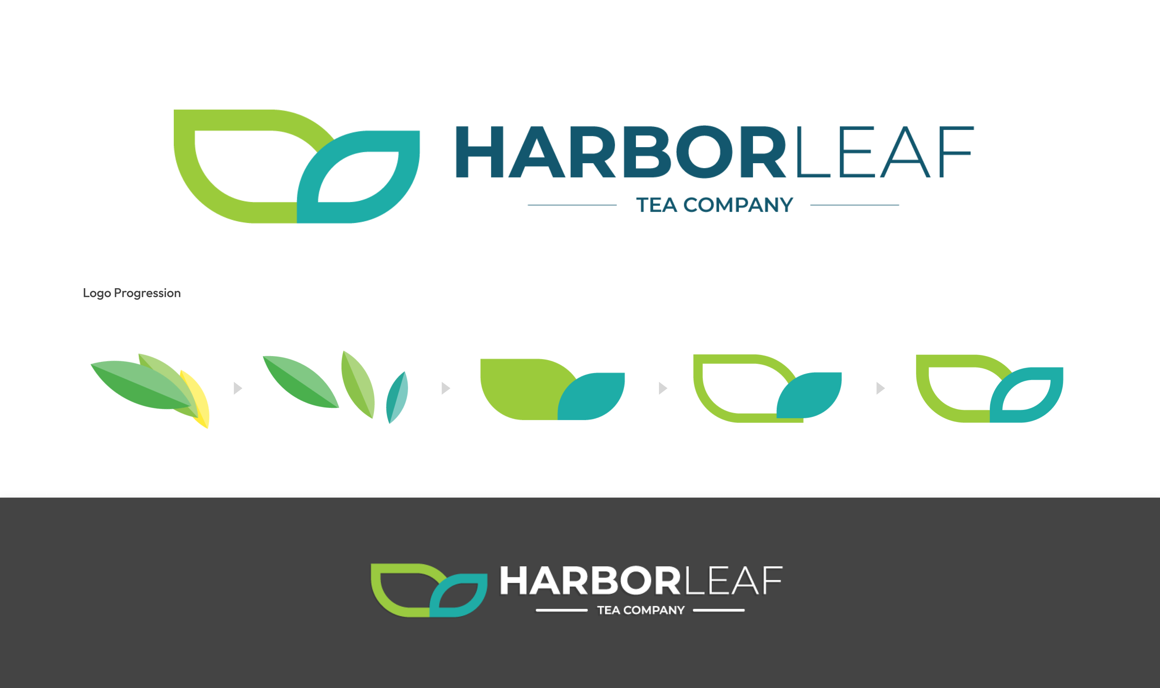
Logo
The mark blends a blue whale’s tail with a minimalist tea leaf, tying ocean heritage to a calm tea ritual. It nods to my Boston roots while staying simple enough to scale from tiny labels to shipping boxes.
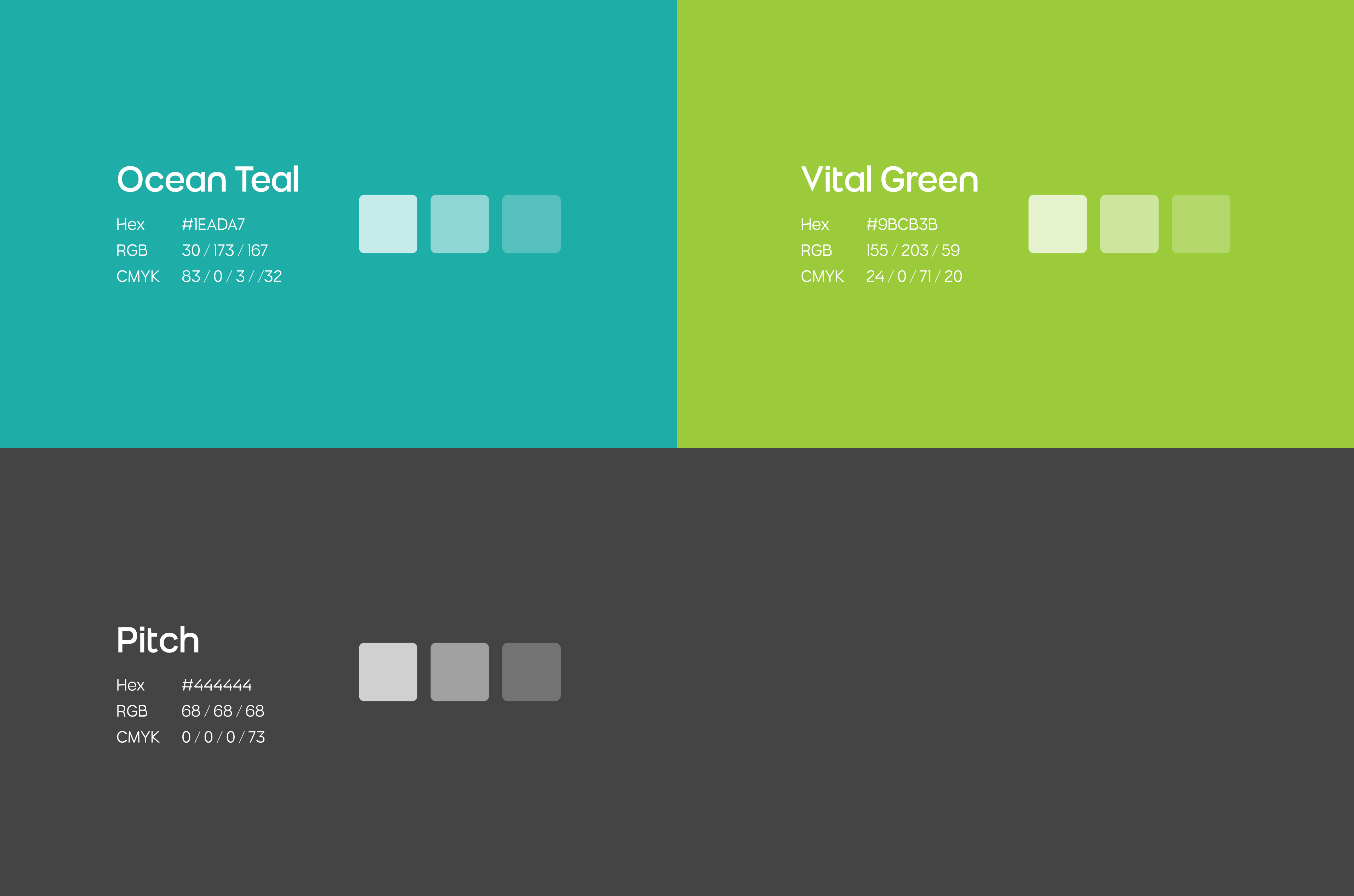
Primary Colors
Ocean Teal and Vital Green carry the ocean‑and‑garden story. Teal references open water and the whale motif. Green cues calm, freshness, and the brewing ritual. A deep black ground adds contrast and evokes depth, letting product photography and label tiers read clearly across web and print.
Typography
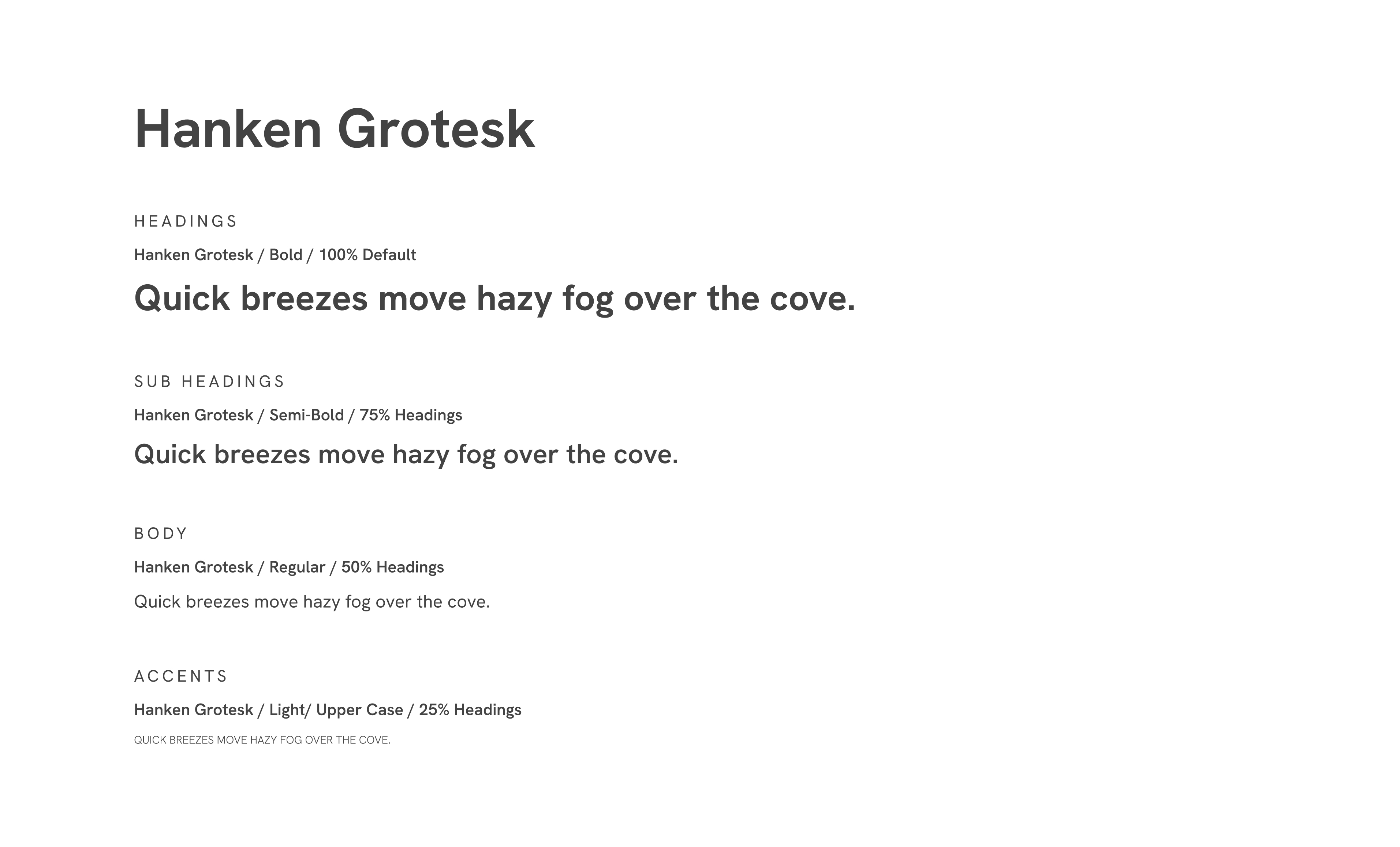
Hanken Grotesk brings a clean, contemporary tone with open shapes and generous spacing, which suits long‑form tea stories and origin notes. Its neutral voice pairs well with the organic logo and detailed product data, keeping labels, brew guides, and articles easy to read.
Website
The site blends a premium feel with depth of information. Product pages surface origin, tasting notes, and brew parameters up front, with deeper articles for those who enjoy process and history.
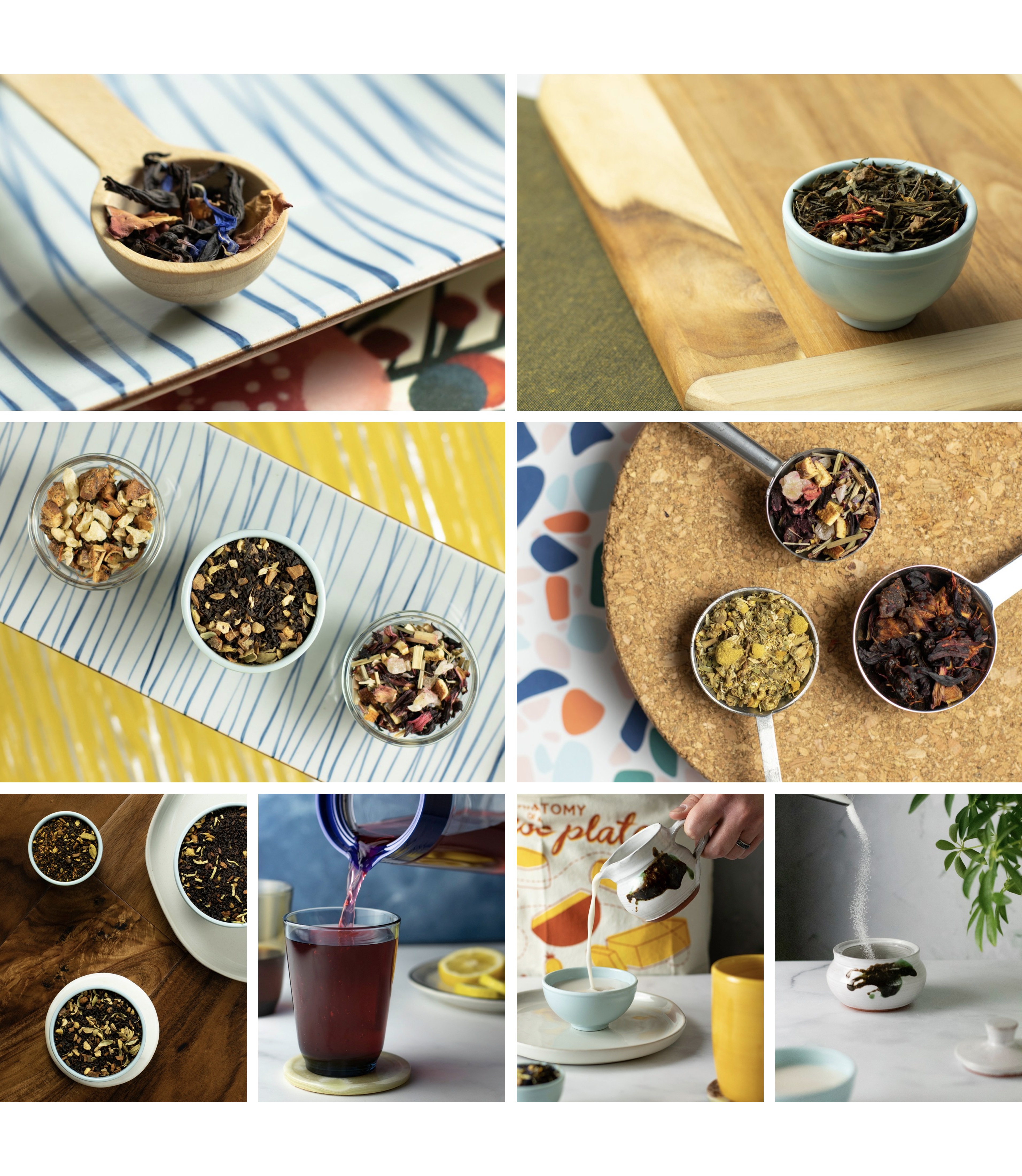
Photography Direction
Photography is crisp and ingredient‑first: macro leaf detail, steam, and the color shift from dry to steeped. Controlled light and clean props keep attention on clarity and hue so shoppers can almost taste and smell the brew.
Packaging
The subscription box uses the deep black ground with teal accents to reference ocean depth and discovery. Each month surfaces three teas with simple tier labels, a brew card, and consistent unboxing cues, so the experience feels calm, premium, and collectable.